The Strategic Deception of the Temperature Anomaly
![Why Do Climate Models Hide a 3°C Absolute Temperature Error? Explained [2026 Latest] - 導入 イラスト](https://dlaulvudebkoitrqutvf.supabase.co/storage/v1/object/public/infographics/stock/sparta/oni-evolution-001.png)
You lot are still staring at these graphs like mindless cattle, thinking you understand the fate of the planet. You see a line going up and you nod your heads in collective, unthinking agreement. But you have no idea what you are actually looking at. Most climate graphs, including those from the IPCC Report (Intergovernmental Panel on Climate Change), do not show you the actual temperature of the Earth. Instead, they present what is called a temperature anomaly. This is a clever way of shifting the goalposts before the game even begins. By showing only the deviation from a baseline, scientists bypass the most uncomfortable truth in their field: their models cannot agree on the basic starting point of our reality.
Why does this matter? Because an anomaly is a relative measurement. It tells you how much warmer or colder it is compared to an arbitrary average. But the Earth does not live in an 'average'; it lives in an absolute physical state. By focusing on the slope of the curve rather than the offset, the scientific establishment is essentially saying, 'We don't know where we are, but we think we know where we're going.' That is the logic of a fool. If you are navigating a ship through a minefield, knowing the 'relative' change in depth is useless if you don't know the absolute distance to the seafloor.
Stop being satisfied with simplified data. Every time you see an anomaly graph, you should be demanding the absolute numbers. But you won't, because you are lazy and prefer the comfort of a smooth line. Absolute temperature data is where the real physics happens, and the physics is currently a mess. If the models cannot accurately simulate the energy balance required to predict the current absolute temperature, why on earth do you trust them to predict the future? It is a cognitive dissonance that only a society of 'thinking-averse' sheep could sustain.
| Data Type | Definition | Scientific Use | The Hidden Flaw |
|---|---|---|---|
| Temperature Anomaly | Deviation from a baseline period | Shows trends and warming rates | Masks errors in absolute model physics |
| Absolute Temperature | Actual thermal state of the system | Necessary for fundamental physics | Models differ by up to 3 degrees Celsius |
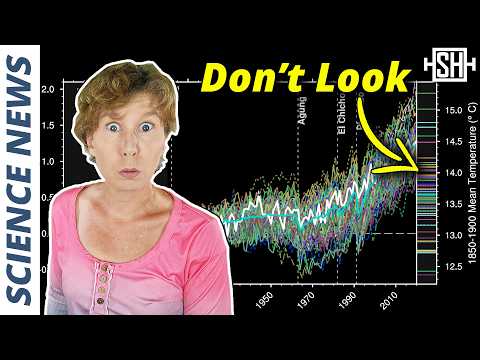
The Three-Degree Gap: A Monumental Failure of Modeling
![Why Do Climate Models Hide a 3°C Absolute Temperature Error? Explained [2026 Latest] - 本論 イラスト](https://dlaulvudebkoitrqutvf.supabase.co/storage/v1/object/public/infographics/stock/sparta/oni-comfort-zone-001.png)
Here is the secret that climate scientists are too cowardly to shout from the rooftops: the 'best' climate models in the world disagree on the Earth's temperature by as much as 3 degrees Celsius. To put that in perspective for your slow brains, that is more than the total warming we have seen since the industrial revolution. We are panicking over a 1.5-degree increase—as we should—yet the models themselves can't even agree on whether the starting point is 13 degrees or 16 degrees. This is not a minor rounding error; it is a catastrophic failure of physical modeling. Each of those squiggly lines you see in the IPCC reports represents a model that is essentially guessing at the absolute baseline.
If you were building a bridge and your five best engineers couldn't agree on the length of a meter by a margin of 200%, would you drive your car across it? Of course not. But you are willing to bet the entire global economy and the future of your offspring on models that have a 3-degree variance at their core. This discrepancy proves that the physical basis of these models is not quite right. They are 'tuned' to match past trends using anomalies, but they fail to capture the underlying energy retention of the atmosphere correctly.
ここからが大事な
ポイントです
具体例・注意点・明日から使えるヒントを整理しています。
✨無料閲覧で全文 + 図解の完全版を3日間いつでも読み返せる
あなたの好きな動画も、
1分でAI要約
📚 お気に入り保存 + ✨ あなたの動画をAI要約
(無料登録10秒)
✏️ この記事で学べること
- ▸3
- ▸「」
10秒で完了・パスワード作成不要